LDN London
A clearer, calmer website for one of London's longest-standing learning disability charities.
From ten menu links to three clear next steps
In December 2025, a parent arriving at ldnlondon.org met ten menu links, a headline laid over a busy photograph and five identical buttons under the words Find out more. Today they meet six menu items, a plain headline and three clear next steps: find a service, work for LDN or play the LDN Lottery. Here is how we got there.
Our brief
By December 2025, LDN London's homepage had ten menu links, with Accessibility appearing twice across the header. The headline sat in thin white type over a busy photograph, with one button beneath it: About us.
Next came a block of small white text on light teal, beside five white buttons of equal weight. They read Work with us, Find support, LDN Community Hubs, Read our latest annual report and Join our LDN Lottery. Someone looking for help had to sort themselves into the right box before the site had explained anything.
Further down, the pink that should have drawn the eye to Donate also coloured headings, panels, figures and links, so nothing stood out. The section explaining what a donation pays for set whole sentences in large display type across a photograph.
LDN's own people confirmed what the page suggested. In a survey of staff and stakeholders, the words that came up most were simple, easy and clear. People said the site felt cluttered and awkward on a phone. Eligibility, and what happens after you get in touch, were hard to find. The team also struggled to update the site themselves.
The brief had four parts:
- A genuinely accessible site, meeting WCAG 2.2 AA as a minimum and AAA where feasible.
- A direct route to support for families.
- Fundraising and jobs brought forward.
- A system LDN's marketing team could run once And Another Day handed it over.

Our approach
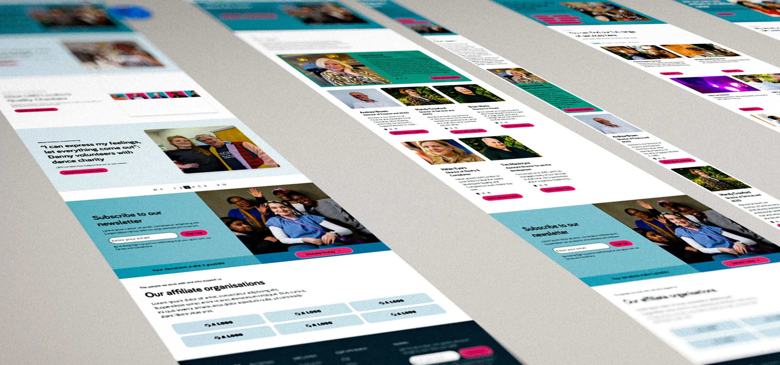
LDN's people are the experts on their own community, so we listened first. Staff, trustees, family workers, the recruitment team, the Hub Men's Group and the charity's SEO partner all shaped the work. The survey gave us clear priorities to design against. Families who may be stressed or overwhelmed came first.
We studied how other organisations serve similar audiences, including Mencap, Scope, Mind, Understood and RNIB. RNIB taught us the most. It has no carousels, it gives content room to breathe, and its pink is only ever used for something a visitor can do. That became a principle for LDN: one colour for actions, with nothing else competing for attention.
We tested the brand palette against contrast standards. The familiar pink and light teal failed WCAG AA as text colours, and white text on them failed too. Rather than drop colours people liked, we found deeper shades of the same pink, teal and blue that pass AA or AAA, and set out where each one could be used.
For people who find processing information difficult, a layout that changes from section to section has to be relearned each time. So we kept repeating sections consistent and text off complex photographs. We also avoided carousels, tabs and anything that moves on its own.
The navigation was rebuilt around what people come to do, rather than how the charity is organised internally. Services are grouped by need, factsheets move out of PDFs into readable pages, and Donate stays in view. We also set a simple rule for imagery: photography for people's stories, illustration for practical information.

Our solution
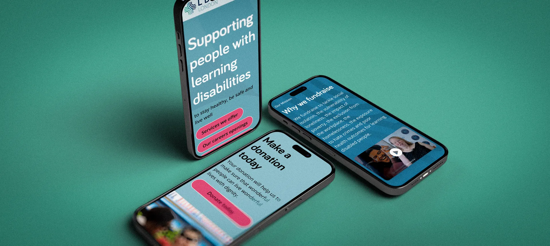
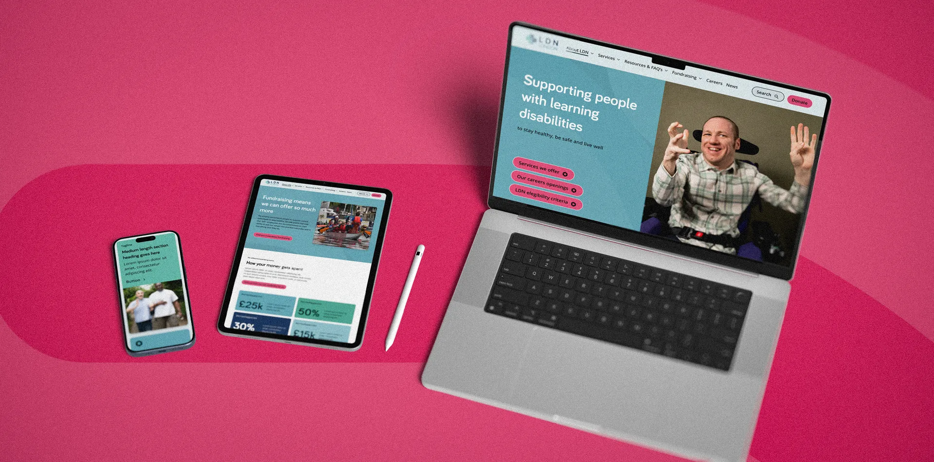
We designed the full site across desktop and mobile, as a system And Another Day could build and LDN's team could run.
- Navigation cut from ten links to six, with Search and Donate always in view
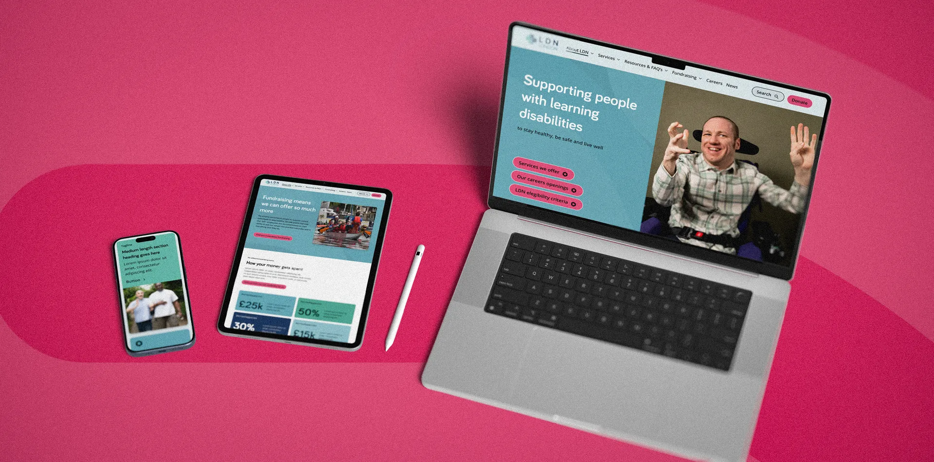
- A homepage that opens with three clear next steps: find a service, work for LDN or play the LDN Lottery
- Services organised around what people need, with eligibility and next steps made visible
- A colour system built from accessible shades of LDN's own palette, with a single colour reserved for actions
- A type scale pairing Bariol headings with Open Sans body text
- Consistent, predictable layouts with no carousels, no tabs and no text over busy images
- Factsheets as proper web pages, with the PDFs still available to download
- Landing and detail pages for services, fundraising, jobs, news and resources
- A flexible block library so the team can publish without a developer

Our impact
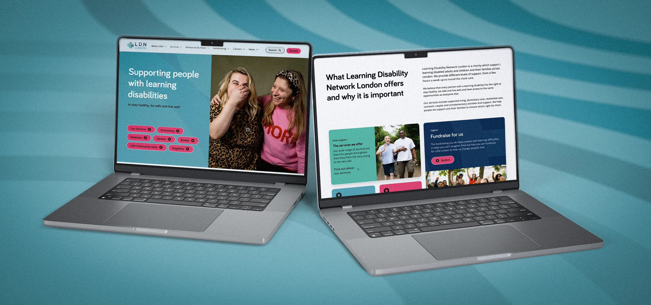
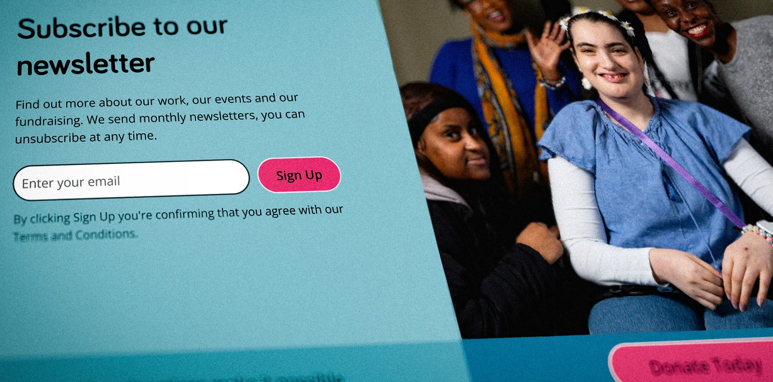
Today the homepage opens with a plain headline and three clear choices. The menu is shorter, and Donate and Search sit in the header on every page. What a donation pays for is laid out as three labelled cards: toys and equipment, days out and community workshops. The sentences no longer stretch across a photograph.
The site went live in spring 2026, and LDN's team has been publishing to it ever since. Recent posts range from changes to its Family Service to interviews with its own support workers.
The most useful parts of the design came from LDN's people. Our job was to listen carefully, turn what we heard into a clear system, and hand over something the build team and the charity could both work with.
Need a clearer, more accessible website for your charity? See how we approach charity website design.

Let's chat about your project
We're here to help you get your organsation off on the right foot, whether that be with its branding, digital products or both, we can't wait to connect with you.

"Matt made the design process straightforward and fun. He listened to our needs and concerns and wasn't phased by random questions or suggestions."
LDN London