The Mary Rose Trust
A clearer, more immersive digital experience for one of the world’s most important heritage stories.
Bringing a world-class heritage site to life with the digital presence it deserves
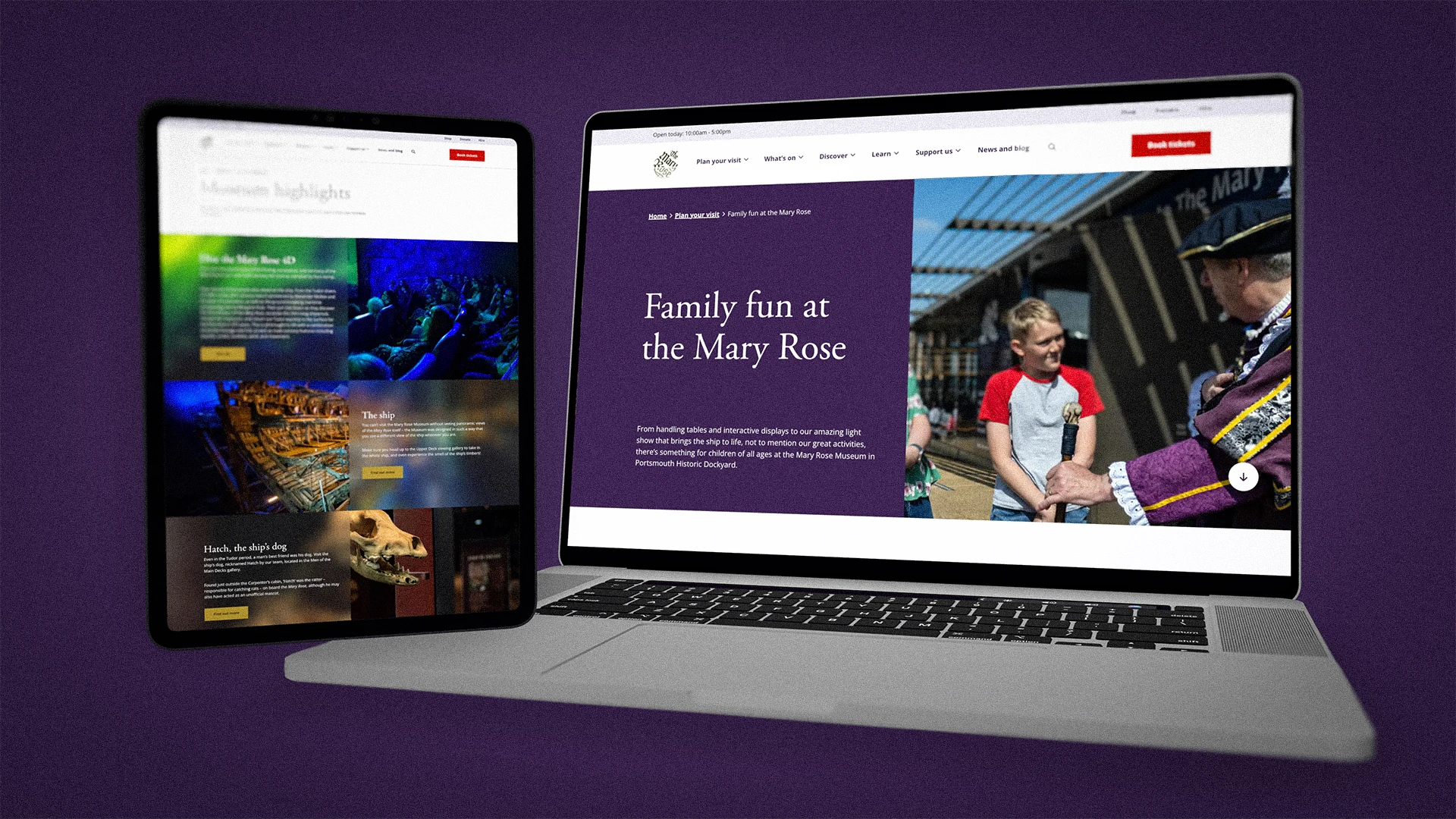
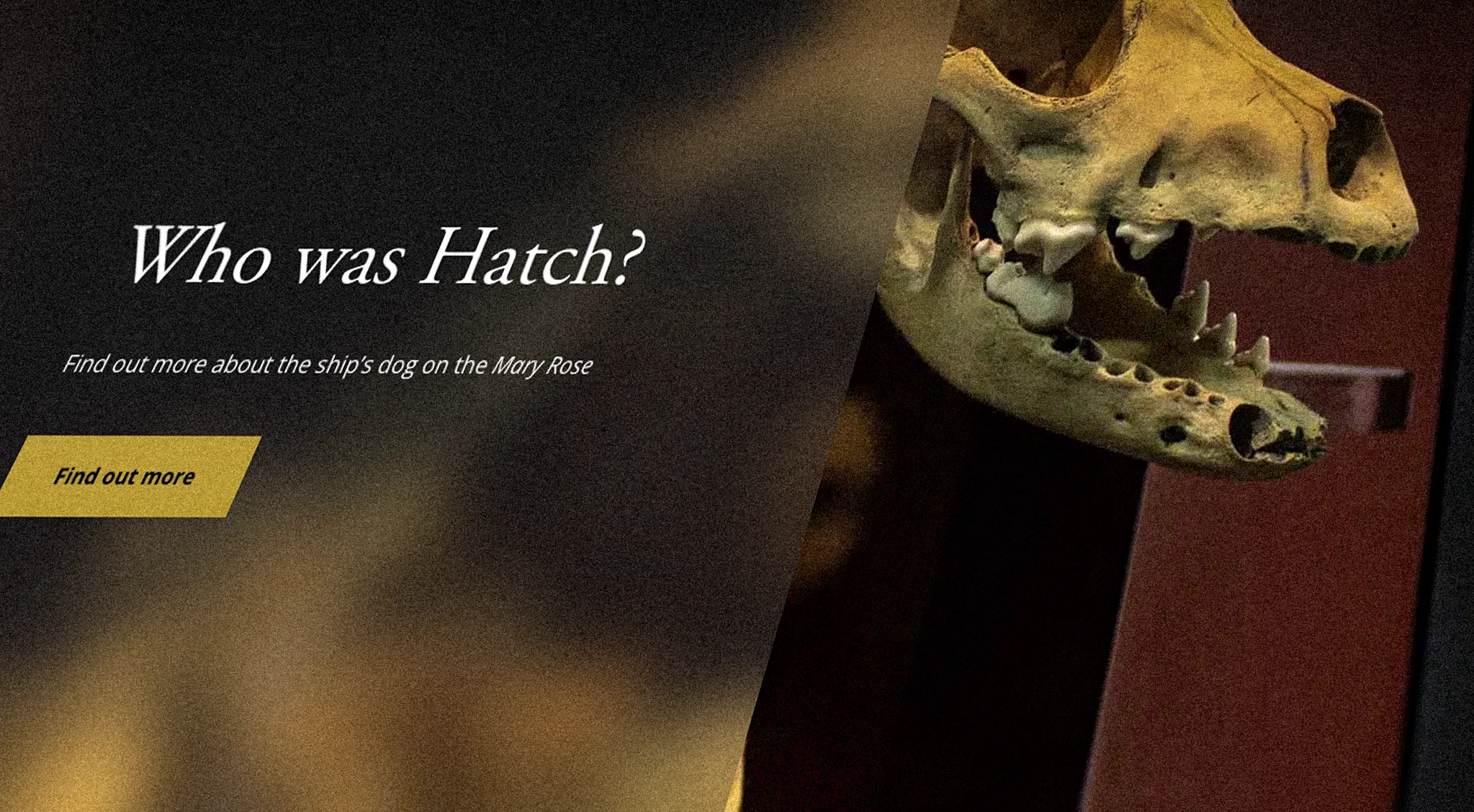
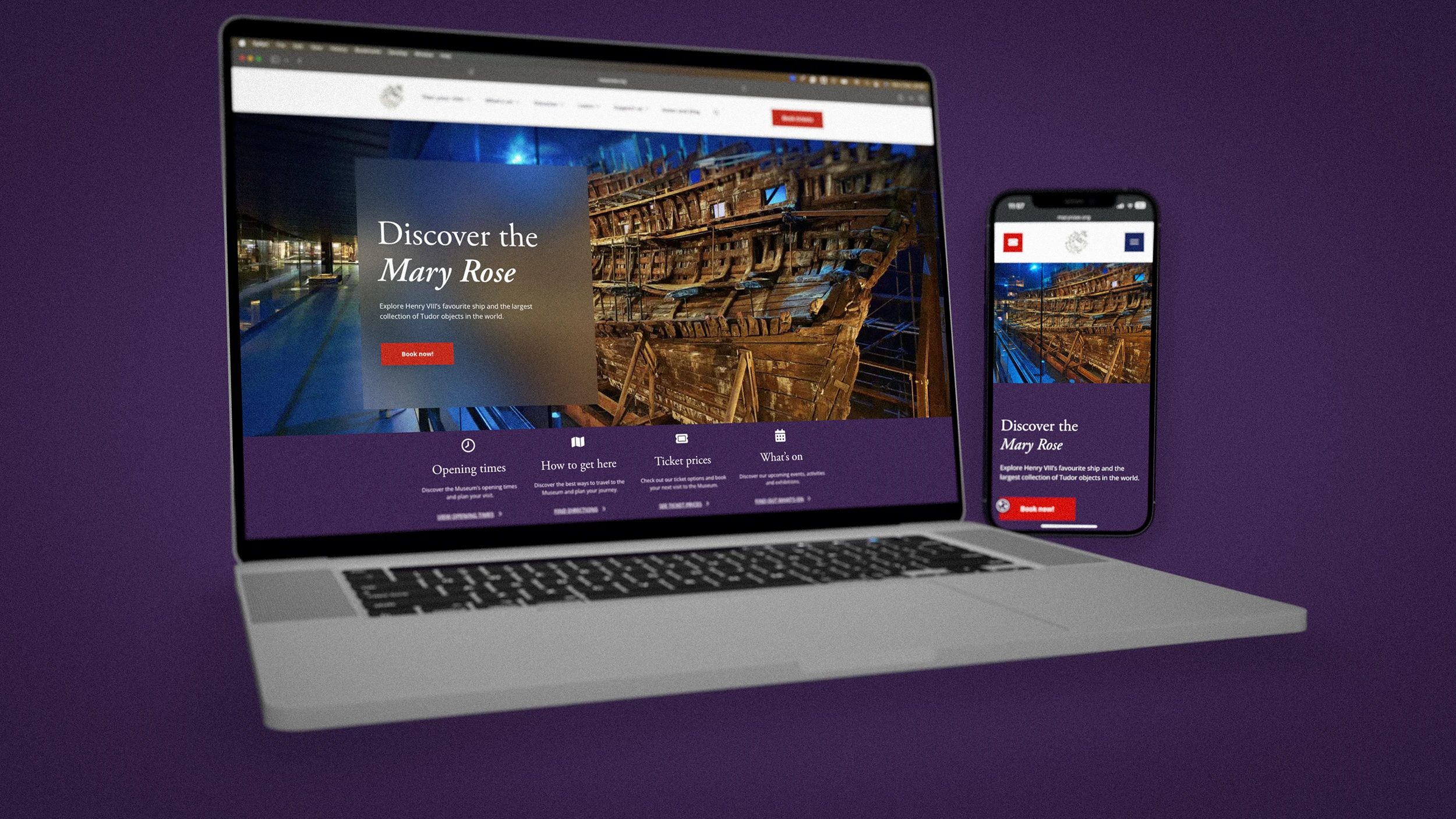
The Mary Rose is one of the most extraordinary heritage stories in the world, and the digital experience needed to match it. We helped the Mary Rose Trust bring clarity to a vast collection of content, while elevating the visual identity with more warmth, depth, and authenticity. Inspired by Tudor stained glass, we created a stronger typographic and colour system and shaped a clean, intuitive website that encourages discovery at every click. The result is a more immersive, accessible experience that helps visitors explore the ship’s history with ease.
Our brief
The challenge was twofold. First, the Mary Rose Trust needed a website that could stand confidently alongside the world’s leading heritage attractions. It had to feel credible, contemporary, and worthy of the story it tells.
Second, the site needed to organise and present an immense collection of content in a way that felt clear, engaging, and accessible to every visitor. With so much material, the experience had to guide people naturally, helping them discover what matters without getting lost.
Alongside the user experience, the Trust also wanted to evolve a visual identity that had started to feel muted and dated. The goal was not to replace the existing brand. It was to elevate it, bringing more warmth, depth, and authenticity while staying true to the Mary Rose and its Tudor heritage.

Our approach
We began by immersing ourselves in the world of the Mary Rose, exploring the ship’s story and the artefacts that bring it to life. That research shaped both the structure of the experience and the tone of the visual language.
From there, we focused on two things in parallel. We created clarity across the content, so visitors could move through the site with confidence. And we developed a stronger, more distinctive design system that could carry the richness of the story without feeling heavy or old-fashioned.
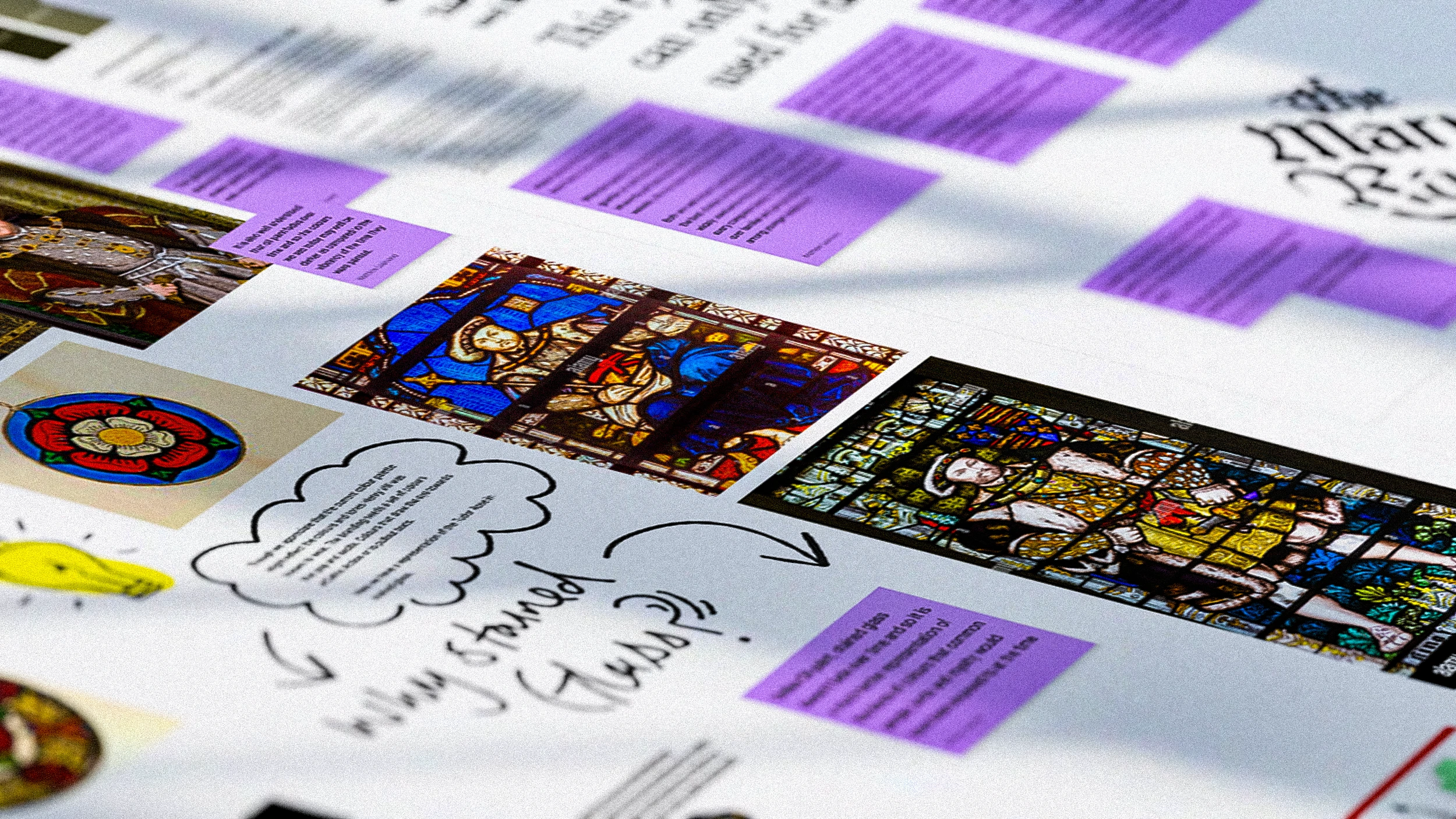
A key creative insight came from looking beyond the usual Tudor references. Instead of leaning on oil paintings of Henry VIII, which often lose vibrancy over time, we studied stained glass from the same period. Its colour, texture, and light endure for centuries. That sense of permanence became the foundation for an updated palette and a more luminous, historically grounded visual language.

Our solution
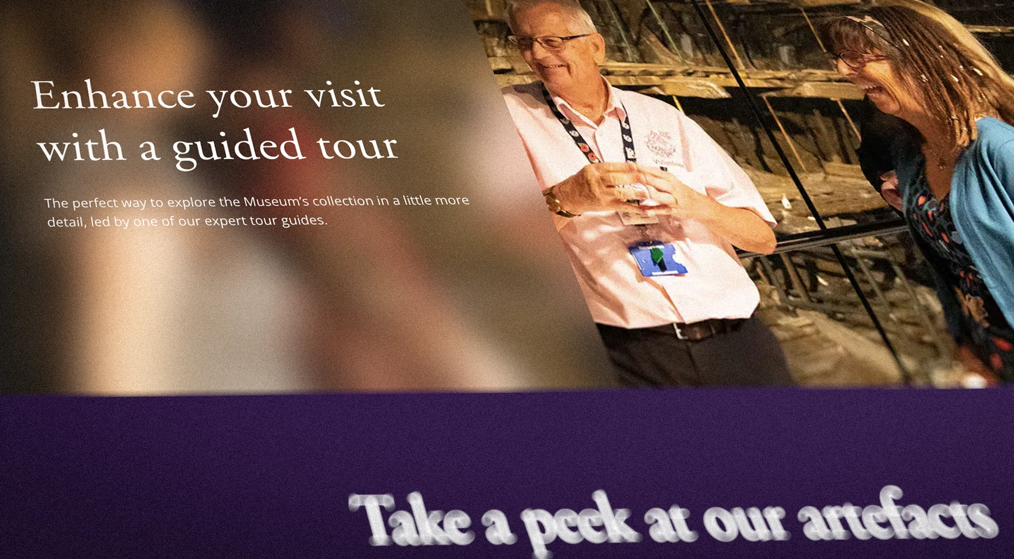
We delivered a redesigned website experience that makes discovery feel effortless, while elevating the brand in a way that feels authentic to the Trust.
- A clearer content structure to make a large volume of information easier to explore
- A clean, intuitive interface designed to support accessibility and engagement
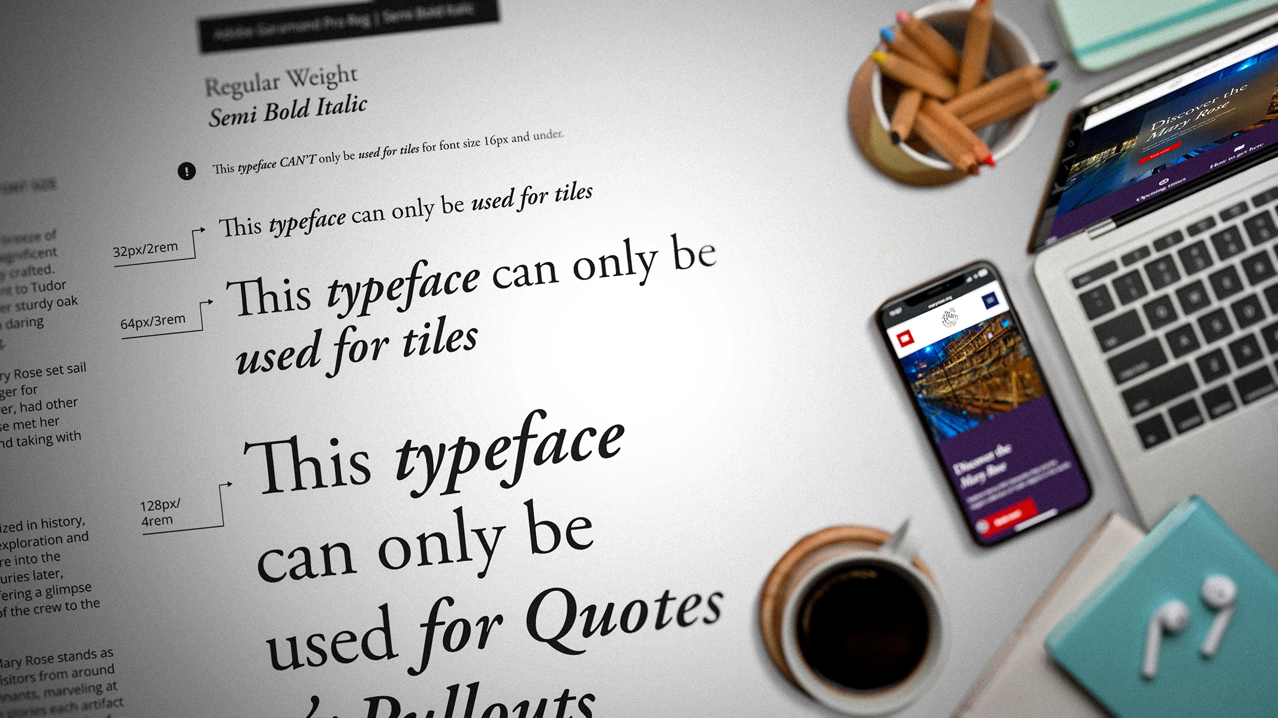
- A new typographic system to improve readability and strengthen character
- An enhanced colour palette inspired by Tudor stained glass, adding warmth and depth
- A refined visual identity that elevates the existing brand rather than replacing it
- A more immersive, story-led experience that encourages discovery at every click

Our impact
The redesign transformed how audiences experience the Mary Rose online. Visitors now move through the ship’s history via a seamless, inspiring journey, with content and collections that unfold naturally as they explore.
The work also strengthened the Trust’s digital presence, helping the website feel more confident among world-class heritage attractions. It has been recognised for its clarity, accessibility, and visual strength, and feedback from guests and staff has been overwhelmingly positive.
It was a privilege to contribute to the continuing story of the Mary Rose. The project reinforced a simple truth: good design does not just modernise heritage. It helps keep it alive.

Let's chat about your project
We're here to help you get your organsation off on the right foot, whether that be with its branding, digital products or both, we can't wait to connect with you.