Cancer Research UK Cambridge Institute
Helping a world-leading research institute show the people and purpose behind its science.
Opening up a research institute to the people it hopes to recruit
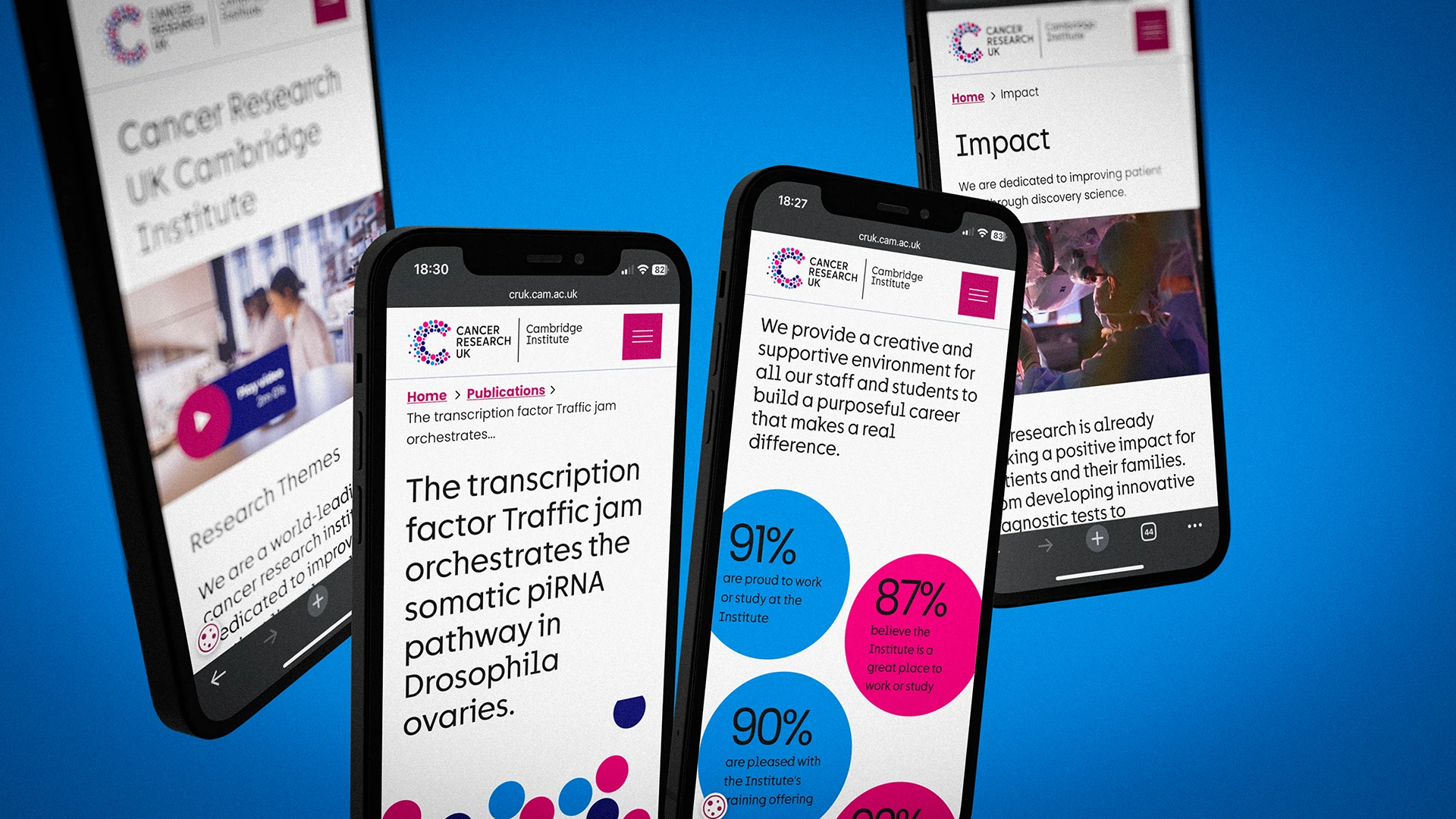
In December 2023, a researcher weighing up a move to Cambridge met eleven menu links, full academic paper titles and a blog last updated in June. Today they see one sentence about why the Institute exists, six research themes each explained in a line, and a clear invitation to build a career there.
Our brief
In December 2023, the Institute's homepage spoke mostly to people who already worked there.
Under the University of Cambridge header, the Institute's name sat on a purple band above eleven menu links. Three of them, Operations, Our Staff and Intranet, were really for staff.
The introduction was a single dense paragraph. Below it, four news cards gave equal weight to a job advert, an obituary, a grant award and a student prize.
The rest of the page listed seminars, publications, jobs and blog posts in four narrow columns. Publications appeared under their full academic titles, some running to four lines. The most recent blog post was dated June 2023, six months earlier. Nothing on the page showed what it was like to work there, or what the research had achieved.
The brief had two parts:
- Organise a very large amount of content for researchers, students, partners and prospective staff, so each could find their way without first having to understand how the Institute is organised.
- Show what makes the Institute compelling when it can't compete on salary: purpose, belonging and a culture driven by impact.

Our approach
We began by mapping everything that already existed. The site had grown to eleven top-level sections, with current and former research groups listed side by side and a COVID-19 response page still in place. A content audit of every page's purpose and value gave us the evidence to simplify with confidence.
We then mapped journeys for the people the site most needed to reach, including students and the external research community. We followed how each would move from the homepage to a research group, a core facility, a vacancy or a seminar.
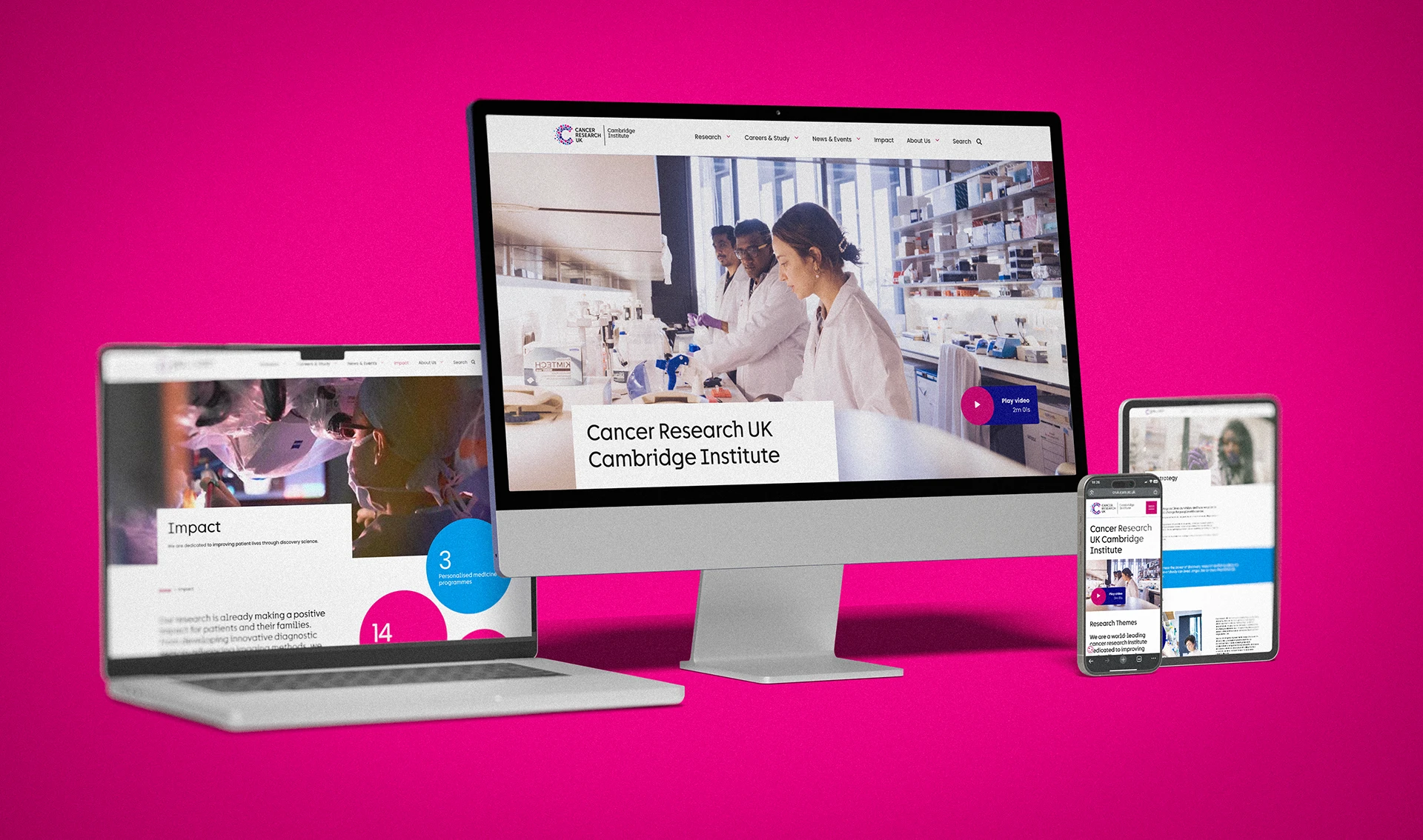
The new structure brought eleven sections down to five: Research, Careers and Study, News and Events, Impact, and About Us. Staff tools left the public menu. Research was organised into themes with plain English summaries, so a visitor could understand the science before choosing a group.
Our moodboard set the direction early: a serious subject with a warm, human personality. Save the Children, NRDC and Nexus showed us how organisations make their people the heroes of the story, and how culture and benefits can be shown rather than listed.
Cancer Research UK's brand is strong and recognisable, so we put it front and centre. We worked through the Institute's guidelines, all 250 pages and more of them, and translated their graphic devices for screen. That included the circles drawn from the Cancer Research UK logo.


Our solution
We designed the full website across desktop and mobile, with a component system Rubber Cheese could build and the Institute's team could grow.
- A content audit of every page, assessing purpose, relevance and value
- Navigation reduced from eleven sections to five, with staff tools moved out of the public menu
- Research themes that explain each area of science in a single plain sentence
- User journeys for students and the external research community
- A homepage that leads with purpose, then research, news, progress and careers
- A progress section that shows the Institute's impact at a glance
- Page designs for research groups, core facilities, publications, news, impact, leadership, partnerships, careers, vacancies, search and forms
- A digital translation of Cancer Research UK's brand guidelines, with warmer, more human imagery

Our impact
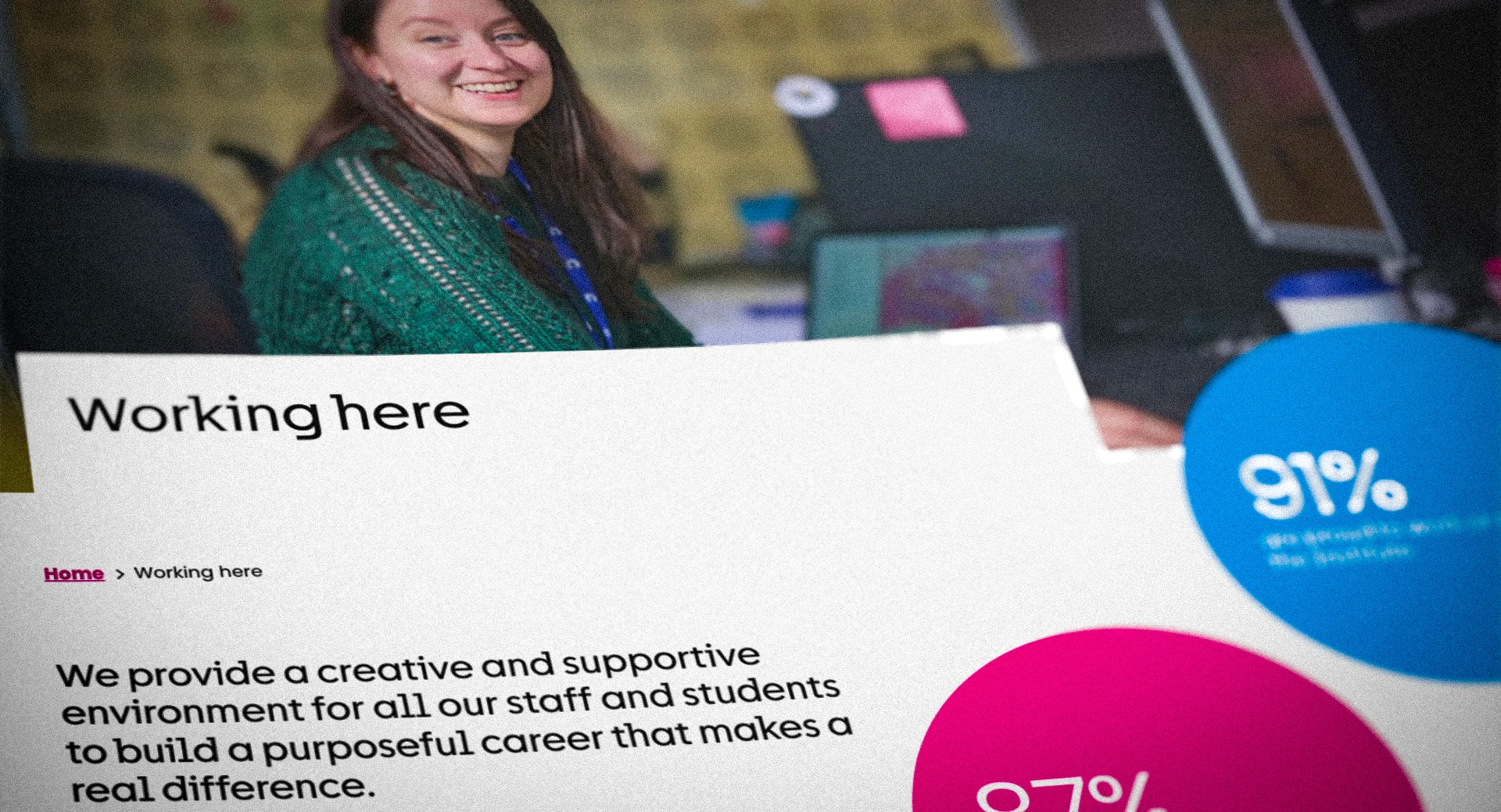
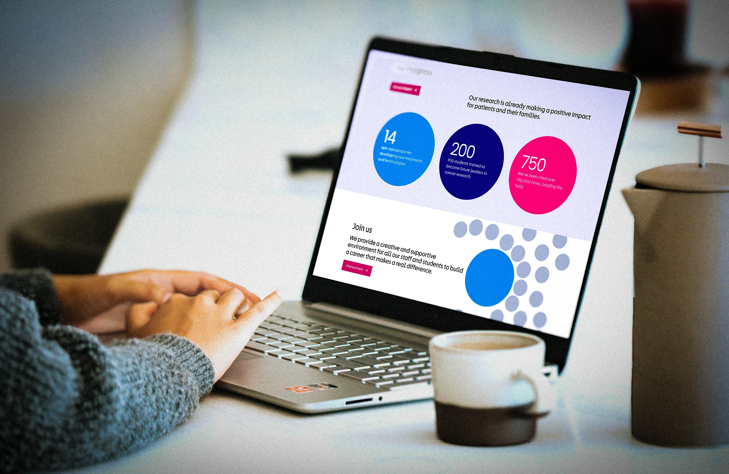
One sentence now comes before anything else on the homepage: the Institute exists to improve patient lives through discovery science. Six research themes follow, explaining the work in plain English, from using artificial intelligence in cancer research to tailoring treatment to individual needs. Further down, the progress section carries the Institute's own figures: 14 spin-out companies, 200 PhD students trained and more than 750,000 citations.
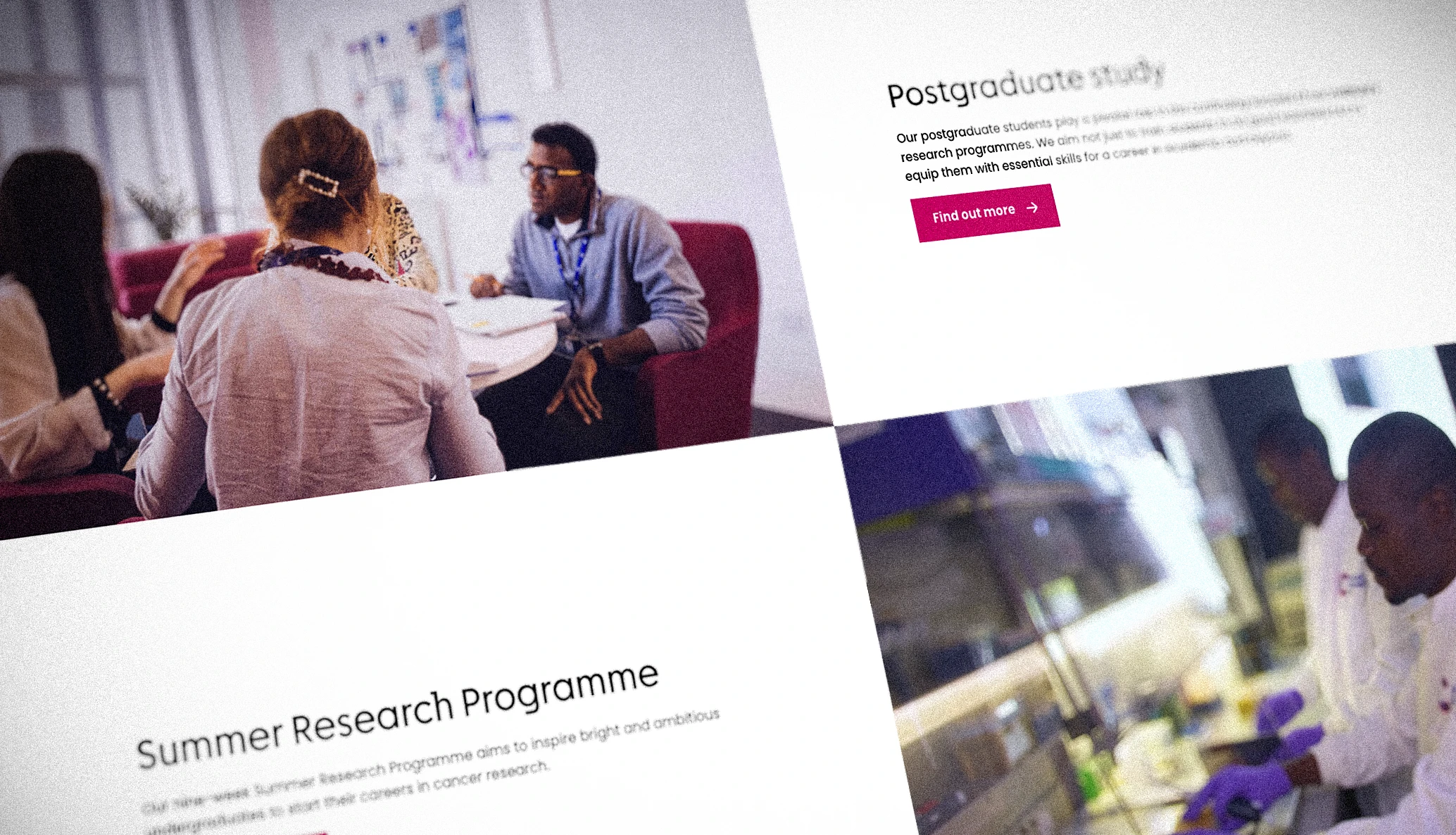
The menu has five sections, and Careers and Study opens with an invitation to build a purposeful career. Stories from Behind the Lab Coat and a 360° virtual tour let people see the Institute before they ever visit.
The site went live in 2024, and the structure has held. More than two years later, the Institute is using that homepage to find its next Director.

Let's chat about your project
We're here to help you get your organsation off on the right foot, whether that be with its branding, digital products or both, we can't wait to connect with you.