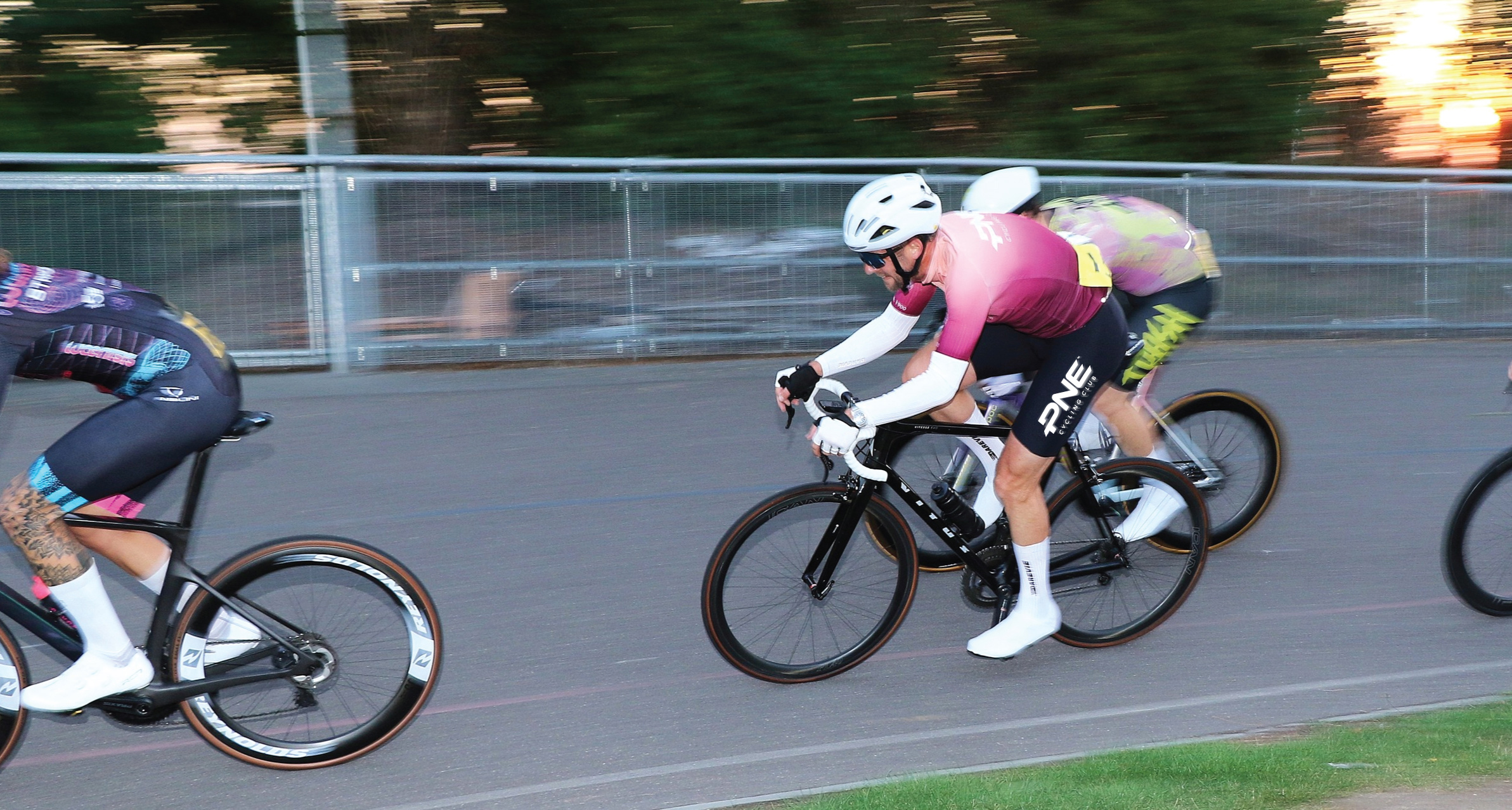
Portsmouth North End Cycling Club
A heritage-led rebrand built for inclusivity, community, and performance.
Making PNECC's long history the focus of a progressing & inclusive rebrand
PNECC is a long-standing Portsmouth cycling club with a proud history and a growing, modern community. They needed a brand identity that could honour that heritage while feeling fresh, inclusive, and genuinely wearable across kit, social, and print. We worked with the club through an open consultation, developed three creative routes, and built a cohesive identity system rooted in PNECC’s original colours. The result is a clearer, more confident presence that members feel proud to represent.

Our brief
Portsmouth North End Cycling Club needed a rebrand that reflected its values of inclusivity, community, and performance.
The challenge was to create something that respected the club’s long history while appealing to younger riders discovering PNECC for the first time. The existing logo and kit lacked cohesion, which made it harder to build pride and consistency across touchpoints.
This was not just a design exercise. The club wanted a process that involved its members, from senior committee members through to grassroots riders. The brief was shaped through open consultation, including a member-wide survey and a formal workshop to align on what the brand should stand for and how it should show up.


Our approach
We treated the project like a community-led identity programme, not a top-down redesign.
We started by listening and gathering input, using the survey and workshop to understand what members valued most about the club, what felt non-negotiable, and what needed to change. That gave us a clear set of themes to design against, and helped us avoid the common trap of creating something that looks good but does not feel like “us” to the people who wear it.
From there, we explored how heritage could be used as a creative advantage, not a constraint. The goal was to create a system that could flex across racewear, social media, and everyday club communications, while still feeling unmistakably PNECC.


Our solution
We delivered a cohesive identity system designed to be easy to apply and easy to feel proud of.
- Three distinct creative directions, built from club themes and member preferences
- A hands-on workshop with the committee to explore and choose a direction
- Heritage research through the club’s archives to uncover original colours and stories
- A clean new wordmark designed to feel both heritage-inspired and contemporary
- A refreshed colour palette celebrating the club’s original hues
- Identity rollout across kit, digital channels, and printed materials
- Simple brand guidelines to help volunteers and suppliers apply the identity consistently

Our impact
The rebrand gave PNECC a clearer, more confident presence, one that reflects the club’s values today while honouring its long-standing place in the community.
Members were directly involved in shaping the new direction, which meant high levels of buy-in and enthusiasm once the branding launched. Kit orders followed quickly. So did social engagement. And the new branding now gives the club a platform to grow into the future.
The rebrand has revitalised the club’s image and strengthened its sense of community. Members embraced the new identity immediately, and the updated kit quickly became a badge of pride at events across the region. Most importantly, the project helped the club reclaim its story, proving that even after more than a century on the road, PNECC is still moving forward with purpose.


Let's chat about your project
We're here to help you get your organsation off on the right foot, whether that be with its branding, digital products or both, we can't wait to connect with you.