
Graphic design in the Swiss Style
Good graphic design makes your message easier to read and understand. We favour the Swiss Style because of its clear grids, purposeful typography and layouts that put your content first. It has stayed current for more than seventy years because clarity doesn't date.


Why the Swiss Style
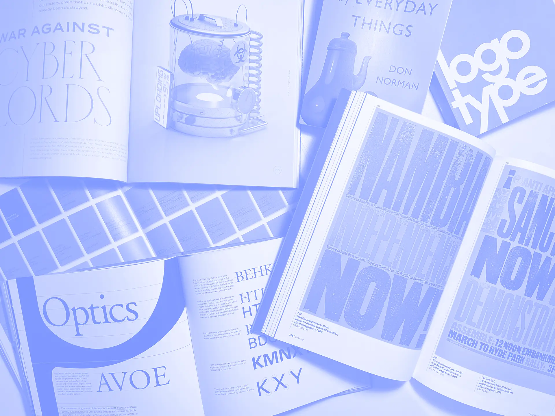
The Swiss Style, also known as the International Typographic Style, grew out of Zurich and Basel in the 1950s. Designers such as Josef Müller-Brockmann, Armin Hofmann, Emil Ruder and Max Huber used mathematical grids, sans-serif type and asymmetric layouts to make information as clear as possible. Typefaces such as Akzidenz-Grotesk, Helvetica and Univers became its signature.
It suits the way we work. Our process starts with your audience and what they need to understand, and in the Swiss Style every decision about type, space and hierarchy serves that message. A grid also carries straight onto the screen, so one system can run from a poster to a responsive website and the components behind it.


Grids that scale
A well-built grid keeps your print, web and social layouts consistent, and makes every new piece quicker to produce.

Type that does the work
Clear hierarchy and legible typefaces help people find what matters quickly, which also makes your materials more accessible.
How it works
Agree what you need
Which pieces, which channels and when, so the most useful assets come first.
Review your brand
We work from your guidelines and existing materials, and note where they've started to drift.
Design the pieces
Each asset is designed to your brand and to the format it will live in.
Test them in use
We check designs on real content, printed proofs or live posts before sign-off.
Hand over
You get production-ready files and editable templates your team can reuse.
Bring clarity to your materials
Tell us what you need designed and where it will be seen.

Our 'why' & promise to you
Clarity has outlasted every design trend of the last seventy years. That's why the Swiss Style still looks current.
This work exists to keep your brand consistent wherever people meet it, and to save your team from starting every piece from scratch.
You’ll get design with a purpose
Each piece is designed for where it will be seen and what it needs to do, with your audience in mind from the start.
You’ll get structure you can see
A clear grid and type hierarchy run through every piece, so your print, screen and social work clearly belong together.
You’ll get craft in the details
Spacing, alignment, colour and production specs are checked before anything goes out.
You’ll get files your team can use
Production-ready files and editable templates mean the next piece is quicker than the last.
Our full list of Services
Questions about graphic design
What is the Swiss Style in graphic design?
A design approach that emerged in Switzerland in the 1950s, also called the International Typographic Style. It uses grids, sans-serif typography, asymmetric layouts and generous white space to communicate clearly.
Who were the key Swiss Style designers?
Josef Müller-Brockmann, Armin Hofmann, Emil Ruder, Max Bill and Max Huber among them. Müller-Brockmann's book Grid Systems in Graphic Design is still a standard reference.
Why use the Swiss Style today?
Because clarity doesn't date. Its grids and hierarchy work as well on a phone screen as on a poster, and its focus on legibility supports accessibility.
Will our materials look plain or like everyone else's?
No. The grid and type give the structure, while colour, imagery and layout leave plenty of room for character. Your brand stays recognisably yours.
What graphic design do you offer?
Brand assets, print, presentations, social media graphics and digital layouts, all designed to the same system.