
Mobile first website design
Many of your visitors will meet you on a phone: on the train, between meetings, or standing outside deciding whether to come in. Designing for that small screen first forces the clear priorities that make a site better at every size.


Start with the smallest screen
On a phone there's room for one thing at a time. Designing there first means deciding what matters most, and that order carries through to tablet and desktop.
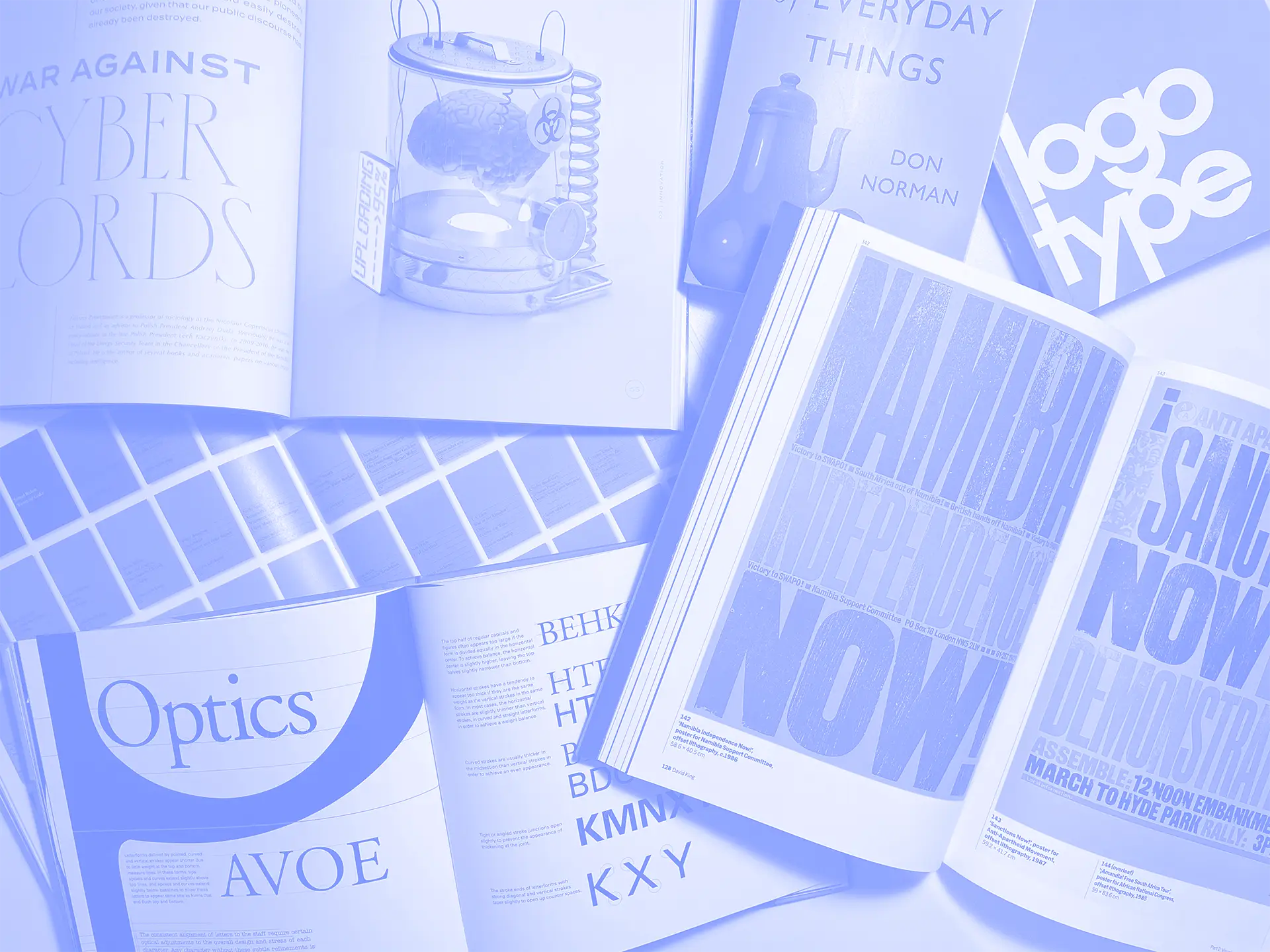
Type matters too. For the Mary Rose Trust, body text moved from Garamond to Open Sans, because Garamond's small counters make long passages hard to read on a phone. Garamond stayed for headings.

Priorities that hold at every size
Your most important content and actions lead on every screen.

Tested on real devices
Layouts are checked across phones, tablets and desktops before launch.
How it works
Align on goals and success metrics
We get clear on what the website needs to achieve, who it needs to persuade, and what “good” looks like for your organisation.
Understand your audience and content
We review what you have, what you need, and what your audience is trying to do. Then we shape a plan for content and structure that supports their journey.
Design the experience and interface
We design key pages and patterns with UX and UI working together, so the site feels intuitive, consistent, and on-brand.
Build and refine
We produce the site with care, test across devices, and refine the details that affect clarity, accessibility, and conversion. We might use Webflow for less complex projects or bring in our partner to build the enterprise-level solution you need. We'll guide you to the right decision.
Launch with confidence
We help you go live with a site your team understands and can stand behind, with a foundation that is ready to evolve.
Check your site on a phone
If it feels cramped or slow there, that's where your next visitor is meeting you.

Our 'why' & promise to you
For many of your visitors, your website is something they hold in one hand. It has to work there first.
This work exists to help you show up online with clarity and confidence, with a website that supports your goals and respects your audience’s time on every screen.
You’ll get clarity before we touch the visuals
You will not be sold a design style first. We will earn the design through goals, audience needs, and message structure.
You’ll have an experience built around real journeys
You will get a site that guides people through the decisions they are trying to make, on a phone as easily as on a desktop.
You’ll get craft in the details
You will get work that feels considered in the small things, from tap targets and type size to load times and layout at every width.
You’ll launch with confidence, not crossed fingers
You will know what is live, why it is live, and how it supports the next phase of growth.
Our full list of Services
Consultancy
& Research
- Competitor research
- Customer journey mapping
- Digital/web strategy
- Usability testing
- User research
- User personas
UI/UX Design
- UI & UX design system
- Information architecture
- Wireframing & prototyping
- User flows & stories
- Conversion rate optimisation
- Accessibility
- Mobile first design
Brand & Design
- Creative direction
- Brand assets creation
- Brand identity system
- Tone of voice
- Brand purpose services
- Brand values
- Print design services
- Design retainers
- Video & motion graphics
- Corporate presentations
- Social asset creation